问题是这样的,使用bootstrap的栅格进行布局的时候,如果大小超过了,会自动的转到下一行,但是在显示图片的时候就会出现缝隙,下面介绍masonry进行缝隙的填补。
好,下面上货。
1、首先是html
代码如下
<scripttype="text/javascript"src="jquery-2.1.4.min.js"></script>
<scripttype="text/javascript"src="bootstrap/masonry-docs.min.js"></script>
<scripttype="text/javascript"src="t.js"></script>
.container-fluid {
padding: 20px;
}
.box {
margin-bottom: 20px;
float: left;
width: 220px;
}
.box img {
max-width: 100%
}
然后是t.js
代码如下$(function() {
var$container = $('#masonry');
$container.imagesLoaded(function() {
$container.masonry({
itemSelector:'.box',
gutter: 20,
isAnimated:true,
});
});
});
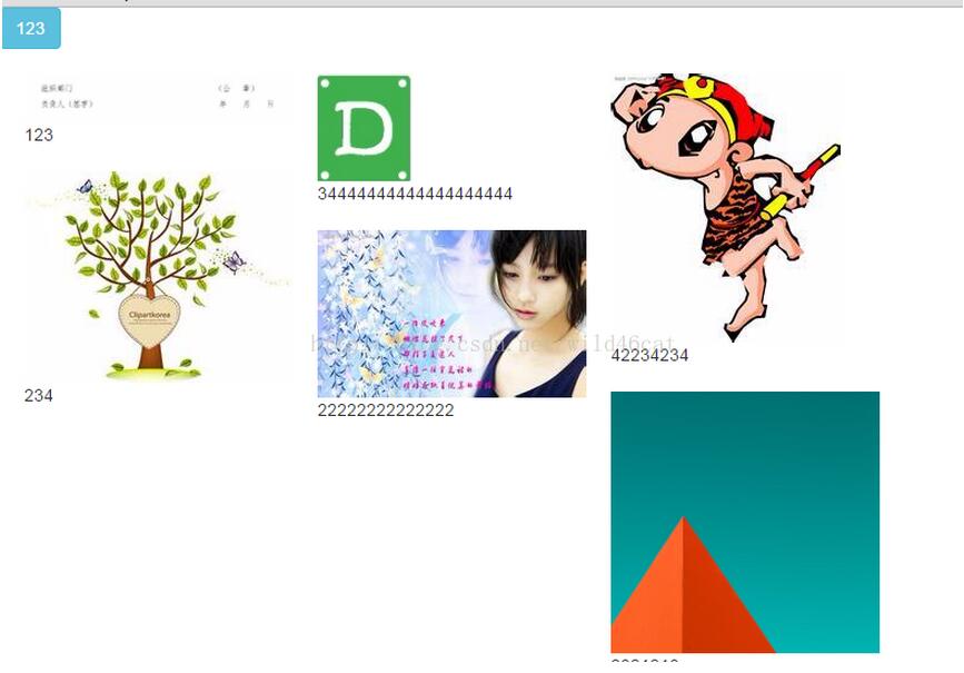
最后是效果图:
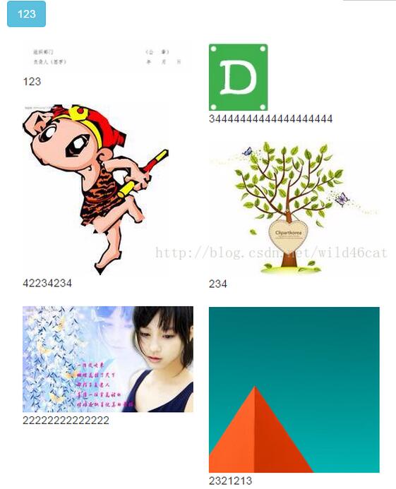
调整浏览器大小,让图片显示成三列:
[bootstrap教程]bootstrap配合Masonry插件实现瀑布式布局
http://m.bbyears.com/css/120280.html
推荐访问:bootstrap面试题